
Invitation Suites
Planning your wedding is such a special process, and should embody your vision as a couple. From the early stages of planning leading all the way up to the big day, each decision helps bring your design to life—and it all starts with the invitation suite.
One of our favorite parts about invitations is the ability to personalize them. Whether you opt for bold color, modern graphics, a custom monogram, or classic white with a traditional script font, your invites should exemplify your wedding aesthetic and your personal style. It’s your guest’s first impression of your big day, and the perfect place to offer a taste of what’s to come.
For Chris and Brian’s 1920’s-themed soiree, we used antique gold and crisp black with graphics inspired by the Art Deco era.

Invitations: Courtney Callahan Paper | Photography: Kevin Weinstein Photography
For their clean and contemporary wedding, Amy & Jon chose a deep blue letterpress and silver foil suite which used typography as the main design element.

Invitations: Elizabeth Grace | Photography: Chad Husar Photography
Brittany & JJ set the tone for their Santa Barbara destination wedding with a sunset-inspired watercolor design. All of the weekend’s details were neatly tucked into the custom die-cut pocket.

Invitations: Magnificent Milestones | Photography: Dennis Lee Photography
Soft and romantic, Carissa & Chris’ invitation suite featured a delicate script font.

Invitations: Magnificent Milestones | Photography: Olivia Leigh Photographie
Crisp white invitations and gold foil kept things traditional, but the addition of a blush envelope added a modern touch.

Invitations: Courtney Callahan Paper | Photography: Ingrid Bonne Photography
Elyse & Ryan’s ceremony programs featured gold foil and a perfectly-tied satin bow.

Invitations: Courtney Callahan Paper | Photography: Ingrid Bonne Photography
We love how all of the details were (literally!) tied together!

Invitations: Courtney Callahan Paper | Photography: Ingrid Bonne Photography

Invitations: Courtney Callahan Paper | Photography: Ingrid Bonne Photography
For Vikram & Joanna’s multi-cultural wedding, we used a nectarine, marigold, and persimmon color palette.

Invitations: Courtney Callahan Paper | Photography: Jennifer Kathryn Photography
By doing a gate-fold invitation, we were able to clearly lay out all of the details of the multiple events in one place.

Invitations: Courtney Callahan Paper | Photography: Jennifer Kathryn Photography
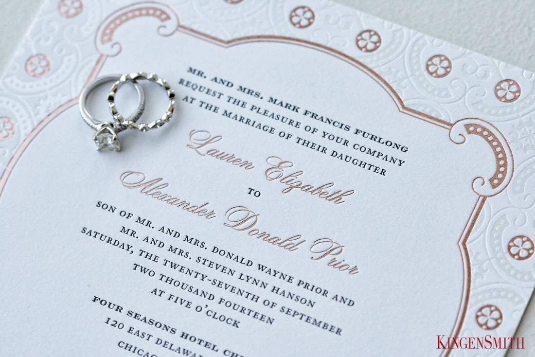
Blind embossing, rose gold, and pattern – oh my!

Invitations: Elizabeth Grace | Photography: KingenSmith
The custom laser-cut detail is to-die-for!

Invitations: Magnificent Milestones | Photography: Nakai Photography
Custom illustrations on the welcome letter injected a little fun to Lindsey and Nate’s otherwise traditional invitation suite.

Invitations: Courtney Callahan Paper | Photography: Dennis Lee Photography
Simple and sophisticated for a country club wedding.

Invitations: Magnificent Milestones | Photography: Wes Craft Photography
For Tiffany & Mike’s celebration at the House of Blues, they kept with the fun theme by creating a save-the-date that resembled a concert poster and included “admission tickets” in the invitation.

Invitations: Minted | Photography: Avery House

Invitations: Minted | Photography: Avery House

Invitations: Minted | Photography: Avery House
Vendors //
Invitations: Courtney Callahan Paper | Elizabeth Grace | Magnificent Milestones | Sarah Drake Design | Minted
Photography: Kevin Weinstein Photography | Chad Husar Photography | Dennis Lee Photography | Olivia Leigh Photographie | Ingrid Bonne Photography | Jennifer Kathryn Photography | KingenSmith | Nakai Photography | Wes Craft Photography | Avery House
Need help choosing invitations? We’re happy to help as part of our Chicago wedding planning or small wedding packages.
No Comments